I bought a new MP3 Player. An MP3 Player is not such an expensive and complex investment that I would be motivated to do product research for several days. After comparing the range of functions, battery life, and browsing Google reviews, I simply ordered two products. I’m not familiar with either manufacturer. The final decision should be made after the direct comparison. A few days later, I unwrap the two MP3 players.
MP3 Player 1: The device looks properly put-together. I take a look at the manual. The layout is extremely confusing and the pictures are spread out all over the page. All graphics consist of an overall view of the device with a few arrows and dashed lines, and none of it speaks to me. I'm not even sure I'm reading the leaflet in the right order. And whatever the button with the triangle is, unfortunately I don’t understand. I have no real desire to work through this manual. Not only that, the paper is thin and the back shines through. Is this an inferior article that I'd rather send back before I get unnecessarily annoyed?
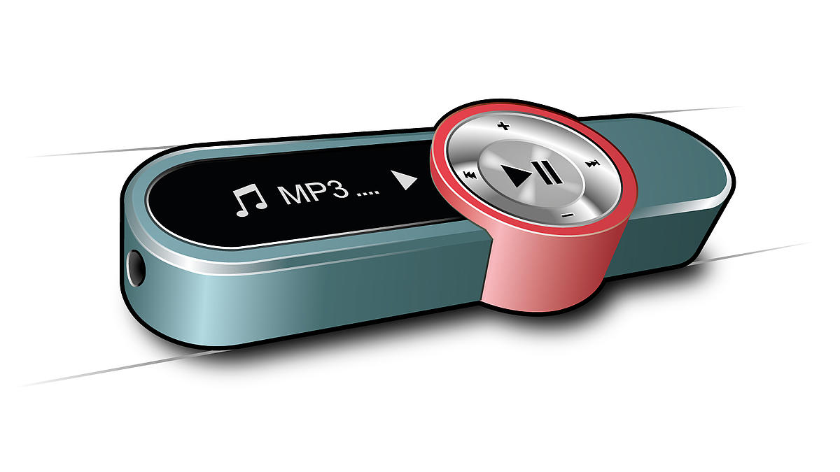
MP3 Player 2: The device looks OK, too. I take a look at this manual as well. The graphic on the first page is very aesthetically pleasing. On the second page, I get a good overview of my new device. You can even create playlists with just one touch of a button. The layout of the next few pages is very tidy; the text accompanying the graphics is evenly arranged in the left-hand column. Small icons help me with the orientation. The graphics are very clear and reduced to their essentials. They are very subtle in grey, but with a fine texture and a tidy appearance. The components described are highlighted in blue – the same blue as in the manufacturer's logo. I believe that I’m now holding a high-quality product in my hands, which I will enjoy a lot.
Of course, I would not make a purchase decision solely on the basis of the manual. But the first impression is often difficult to change, and the instructions definitely affect the overall impression.
The investment in high-quality graphics is not just a luxury for design products. In Contrast: Not placing value in a high-quality graphic concept is a wasted opportunity to distinguish your product as high-quality and also to underscore its own brand value. A coherent overall concept, the integration into the corporate design, and the adherence to design rules can influence the overall visual impression of a manual and also immensely influence the product perception.
If you would like to learn more about "value-added visualisation concepts" and their implementation, I invite you to visit our Seminar on the topic.